1This chapter is divided into three practical tasks in which we use topic modelling and visualizations to explore the content of parliamentary debates before and during the COVID pandemic. We will answer the following questions:
- Task 1: Which topics are characteristic of the corpus?
- Task 2: Which topics did MPs debate on the most?
- Task 3: Which topics were more frequent before and during the pandemic?
6.1. Topics of parliamentary speeches
1In this chapter, we will first prepare a numeric description of the corpus, which is necessary for the LDA methods. Next, we will extract the topics and name them. In the end, we will observe how these topics are distributed in the corpus and how we can find the speech on a given topic.
6.1.1. Computing document vectors
1Before we can begin topic modelling, we need preprocessed data and a vector representation of speeches. We have already preprocessed the corpus (see Chapter 5.4). To compute the vector representation of the speeches, we will use the Bag of Words widget, which constructs a numeric description of the speeches. Using this description, one can compute word distributions for topics or, in other words, perform topic modelling. The numeric description, which we retrieve with bag of words, contains words in columns, with their values representing the number of times a word appears in a given speech. Each speech is thus characterised with a vector, which represents the content of the speech. The more frequent the word, the more prominent the vector of the speech is in the direction of the word.
2However, not all words are equal. Some words in the corpus are procedural or genre-specific (see Chapter 5.4), stopwords (i.e., pronouns, articles) or not specific for a given speech. The word thank, for example, appears in thematically heterogeneous speeches, as many MPs thank the speaker before them. Hence the word is not thematically informative. We would like to weigh the words so that the words specific to a given speech have a higher weight than those that frequently appear across the entire corpus. This type of weighting is called TF-IDF orterm frequency-inverse document frequency (Jones, 1972) and can be selected in the Bag of Words widget.
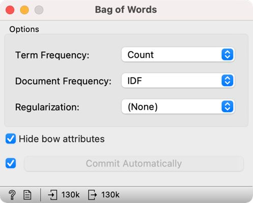
3We add Bag of Words directly to Preprocess Text and set the parameters to keep the Count under Term Frequency and select IDF under Document Frequency (Figure 11).
6.1.2. Topic modelling
1Now that we have the vector representation of speeches, we can begin with topic modelling. If the Bag of Words process completed successfully, continue with Option 1. However, if the computing is taking too long, follow the instructions under Option 2.
| Option 1: follow the tutorial | Option 2: speed up the analysis |
 |  |
| Add Topic Modelling to the canvas and connect it to Bag of Words. From here, continue as described below. | If the computation is taking too long, first open a new session in Orange. Then download ParlaMint-GB-bow.pkl and load the data into Orange with the Corpus widget. The file contains a pre-constructed bag-of-words matrix. Now add the Topic Modelling widget and connect it directly to the Corpus. Continue as described below. |
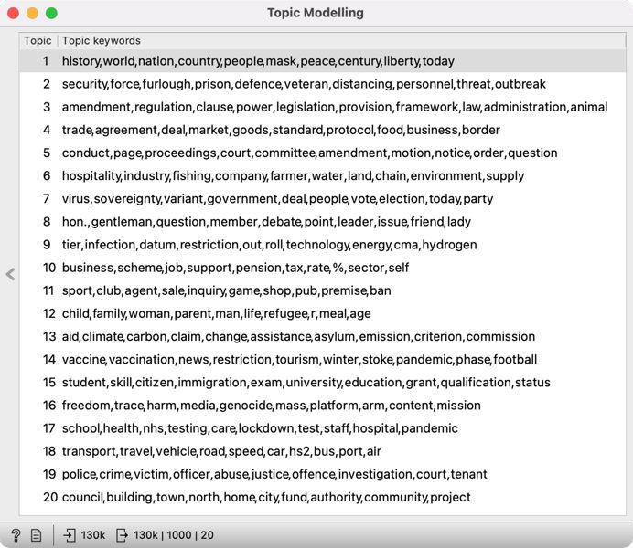
2Open the Topic Modelling widget and select the LDA method. Let us set the Number of topics to 20. The number of topics is up to the researcher, but related work shows that with larger corpora, 20 is a good choice (see Chapter 4). On the right, we see twenty groups of words that characterize the topics in the corpus (Figure 12). Some topics are easy to name, while others appear a little tricky. In the following chapter, we will further explore the topics which will help us to define the topics better.
3It is important to note that LDA is a stochastic method, which means that it returns different results at each run as it is based on a random initial topic assignment. In Orange, we bypass this characteristic by setting a fixed starting point, which enables the reproducibility of the results.
1Try it yourself: use a different number of topics, say 5 or 10. Does a smaller number of topics give better results? What about setting a large number of topics, say 50?
6.1.3. Topic definition
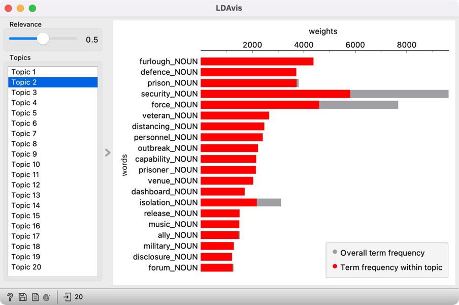
1LDA returns the ten words most related to each topic.15 However, these words are sometimes not informative enough to enable defining a topic. Hence, we use LDAvis (Sievert and Shirley, 2014) to help us define the themes. The main advantage of this visualisation is that it scores words based on how specific a word is in the topic vs in the corpus. The value of the lambda parameter, which can be set in the widget with the Relevance slider, can be between 0 and 1, where 1 displays words based on how specific they are to the topic (as shown in the Topic Modelling widget) and 0 displays words based on how frequent they are in the corpus. The exclusivity of the word in the corpus is called lift, which represents the ratio between the frequency of the word in the topic and the frequency of the word in the corpus.
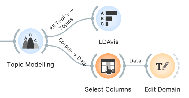
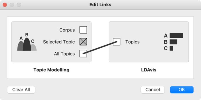
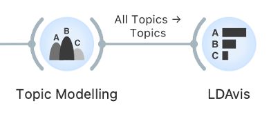
2Connect LDAvis to Topic Modelling and ensure that the right data are sent to the input. The LDAvis widget needs a table of word frequency per topic, which is present in the All Topics output. The output can be edited by clicking on the connection between the widgets and connecting the All Topics signal to Topics (Figure 13).
3By default, LDAvis shows words in balanced order with the same proportion of exclusivity of the word in the topic and the exclusivity of the word in the corpus, which usually gives good results.
4The balanced relevance setting gives a different, more informative set of words than seen in the Topic Modelling widget (Figure 14). It is evident that Topic 2 talks about furlough and essential workers, Topic 4 about Brexit, and Topic 9 about different tiers of responses to the pandemic.
1Try it yourself: move the slider left and right. Which setting gives the best set of words to define the topic?
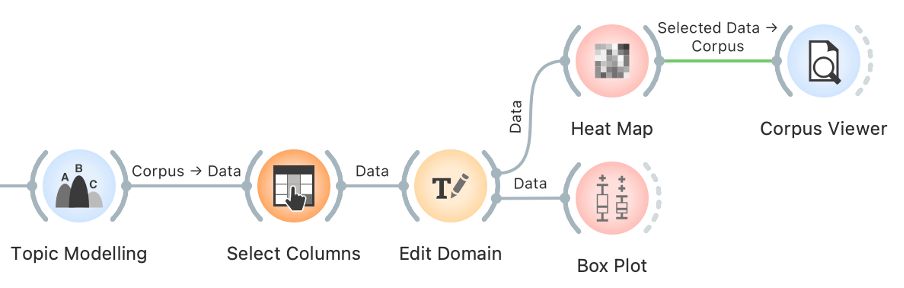
5In this way, we can inspect all the topics. For an easier interpretation of the results, we can replace the generic topic names (i.e., Topic 1) with meaningful labels (i.e., T1: UK & nation). To do this, we connect Topic Modelling with Select Columns and the latter with Edit Domain.
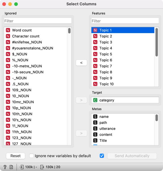
6First, let's open Select Columns, where we see the entire variable list, including word frequencies, which we created with Bag of Words for topic modelling. These variables are no longer needed, so we remove them by selecting all the variables using Ctrl+A in Windows or Cmd+A in MacOS in the Features section and drag-and-drop them to the left side, where all the variables we would like to ignore are placed. We enter Topic in the filter on the left side, which lists only variables containing the name Topic (i.e., Topic 1, Topic 2). Next, we select them and transfer them back to the right side, where all the variables we would like to include in the analysis are placed (Figure 15).
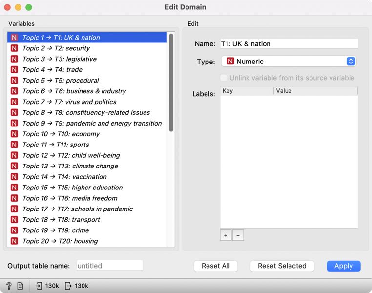
7Then we open Edit Domain, in which we will name the topics. From the list on the left, we select the first topic and set its name in the Name field on the right, i.e., T1: UK & nation (Figure 16). Naming the topics can help interpret the visualizations, which we will use later to explore the topics.
8Once the topics are named, we get a list of topics MPs debated between January 2019 and December 2020. Unsurprisingly, we find some epidemic-specific topics on the list, such as virus and politics and vaccination. Others, such as UK & nation and media freedom, might be more difficult to name if we are unfamiliar with the concurrent events. Roughly, the topics cover the ministry areas, such as security, trade, economy, higher education, transport, and crime. At the same time, looking at the list of missing topics, which one would generally expect to see covered, is telling (i.e., health and social care). The fact that certain topics are missing from the list does not mean the MPs did not debate them, but it does show they were not talked about as much, or that they were debated only in combination with other topics (i.e., the pandemic).
9Such a list of topics enables a quick overview of the themes that characterised parliamentary debates at a given time. However, these results do not reveal additional information, such as which topic was debated the most, how the topics are related to one another and what the topical differences between different periods are. To answer these questions, we have to analyse the results further, which we will do in the following chapters. However, we will inspect how the topics are distributed in the corpus before doing so. In this way, we can better understand the context of speeches and, if necessary, adjust the names of the topics. At the same time, it is a great way to retrieve the speeches where a certain topic is prevalent.
1Try it yourself: name all the topics with a suitable label. Some topics will be harder to define. You can use Corpus Viewer to find a word from the topic and explore its context.
6.1.4. Distribution of topics in a corpus
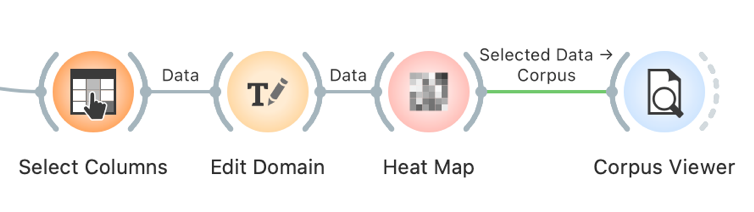
1Due to the nature of topic modelling (see Chapter 4), the speeches are characterised by more than a single topic, but topics will have different frequencies in different documents. Topic frequency or the likelihood of the topic in the speech is given between 0 and 1, where 1 means the topic fully characterizes the speech and 0 means the topic does not characterize it. Since we deal with values on the same scale and want to compare topic frequency, the most suitable visualization is the heat map. Connect the Heat Map widget with Edit Domain.
2Colour represents the value in the visualisation: high values are displayed in yellow and white (or any other colour on the right side of the colour scale). In contrast, low values are displayed in blue (or any other colour on the left side of the scale). Each column represents a topic, and each row a speech. In the visualization, the speeches are displayed in the same order they were read initially, making the diagram quite difficult to interpret. A couple of settings can fix this.
3First, we will join speeches with similar topic distributions. We are dealing with many speeches (130,453), so the visualization is extremely tall. We can represent very similar speeches with a single line and make the visualisation more compact. To do this, use Merge by k-means, which uses the k-means method to join similar speeches. The default value is 50, but we will increase it to 500 because we have many speeches and do not want to lose too many details.
4Visualization is now more organised, but it would be even more informative if similar rows lay close to each other. Note that each row is no longer a single speech but a group of similar speeches. Rows can be further organised with another clustering technique, which we set in the Clustering section. Set the Rows option to Clustering (opt. ordering).
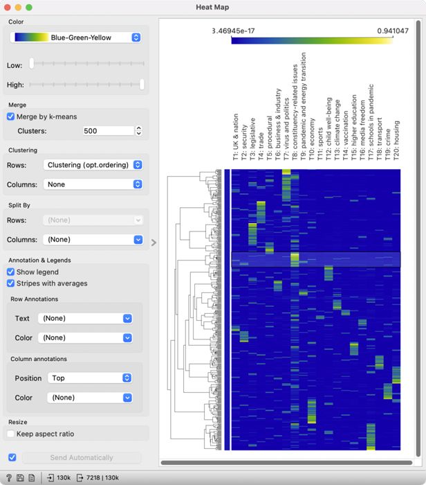
5We see a much nicer diagram (Figure 17) with a dendrogram on the left side. A dendrogram is a tree-like structure of speech similarity, which shows connections between groups and enables an easy speech selection. In the previous chapter, we learned that the interpretation of certain topics is not quite clear, for example, constituency-related issues. The diagram enables selecting speeches for a highly expressed topic, which can be inspected further.
6We have selected T8: constituency-related issues for further observation. Speeches are selected by clicking on a branch in the dendrogram, where the topic is most expressed (yellow or green colour). Clicking will send the selected subgroup to the output of the widget. Now add Corpus Viewer to Heat Map to read a couple of speeches.
7The speeches deal with various topics concerning MPs’ constituents, from access to health care to discrimination against minorities. In this way, we have clarified the topic label and selected a subset of speeches on a given topic, which we can use for downstream analyses.
8When interpreting the results of topic modelling, we need to consider that a speech is not characterised by a single topic but a mixture of them, which we can see for the topic T4: trade. If we select the speeches and give them a careful read, we will see that they touch upon various topics, including the new taxation of foreign goods after Brexit. The topic is also evident from the diagram, where certain topics with high values of T4 also have high values of T3: legislative. These two topics thus overlap in certain points as already evident from the heat map. The visualisation is great for investigating topic overlap, which is crucial if we are interested in selecting speeches on a given topic for further analysis.
1Try it yourself: select speeches about the virus and politics and explore them.
6.2. Topic map
1Now we know the distribution of topics by speech. We have learned that several topics characterise a speech, so we would like to know how the topics are related to one another. Besides, we would like to know which topics are the most prevalent in our corpus. To answer these two questions, we will use a topic map, where the topics will be positioned based on their similarity to one another and marked by their frequency.
2We will construct the map with MDS, which is short for multidimensional scaling. The visualisation tries to find a projection in a 2-dimensional space such that related topics lie close to one another and those unrelated are far apart. MDS computes topic relatedness based on the importance of words in the topic. High relatedness means a very similar word distribution, where some words can be even shared among the topics.
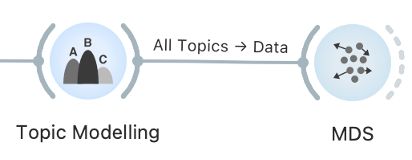
3We set the connection between Topic Modelling and MDS by connecting All Topics to Data. In the beginning, we will see only grey points in space. A point represents a topic. For easier interpretation, we will label the points. We do this by setting Labels to Topics. Each point will be marked with a topic name – not the one we gave them in Edit Domain, but the original names. Thus, we need to use a manually created list of topics for interpretation (Table 1).
| Topic name | Assigned label |
| Topic 1 | T1: UK & nation |
| Topic 2 | T2: security |
| Topic 3 | T3: legislative |
| Topic 4 | T4: trade |
| Topic 5 | T5: procedural |
| Topic 6 | T6: business & industry |
| Topic 7 | T7: virus and politics |
| Topic 8 | T8: constituency-related issues |
| Topic 9 | T9: pandemic and energy transition |
| Topic 10 | T10: economy |
| Topic 11 | T11: sports |
| Topic 12 | T12: child well-being |
| Topic 13 | T13: climate change |
| Topic 14 | T14: vaccination |
| Topic 15 | T15: higher education |
| Topic 16 | T16: media freedom |
| Topic 17 | T17: schools in pandemic |
| Topic 18 | T18: transport |
| Topic 19 | T19: crime |
| Topic 20 | T20: housing |
4We will also set the size of the points to match the frequency of the topic (which is the sum of topic probability in all the speeches, weighted by the length of the speech). Set the Size option to Marginal Topic Probability. To make things even clearer, set the Color to Marginal Topic Probability.
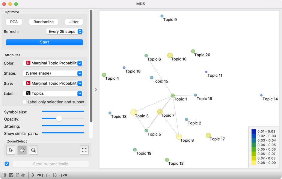
5Thematic map displays topic relatedness with the position of the points, while the size and the colour show how frequent the topic is (Figure 18). When topics are related, but the points lie far apart due to the limitations of the 2-dimensional display, the relatedness is marked with a line between the points. The most frequent topics are T3: legislative and T8: constituency-related issues, while narrower topics such as T11: sports, T13: climate change and T14: vaccination are the least frequent.
6The high frequency of Topic 3 (legislative) is unsurprising, as the parliament is the main legislative body of the state. It is placed close to Topic 5 (procedural), which means legislative speeches contain a lot of procedural words. It is also close to Topic 7 (virus and politics), which shows that the government had to adopt certain legislative measures to combat the pandemic. Topic 7 is also close to Topic 8 (constituency-related issues), which could mean there was a debate on translating pandemic measures into a local environment.
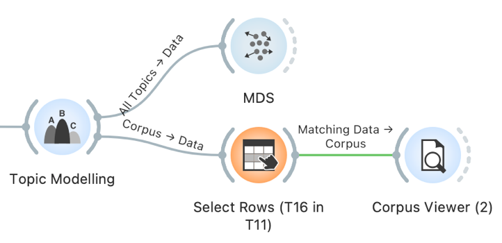
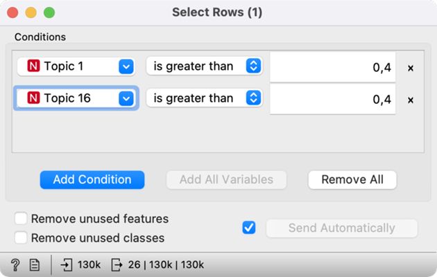
7In short, topics that lie close to each other or are connected with a line are related. However, sometimes it is not easy to understand how the two topics are related — for example, Topic 1 (UK & nation) and Topic 16 (media freedom). To better understand this connection, we can review the speeches with a high frequency of both topics.
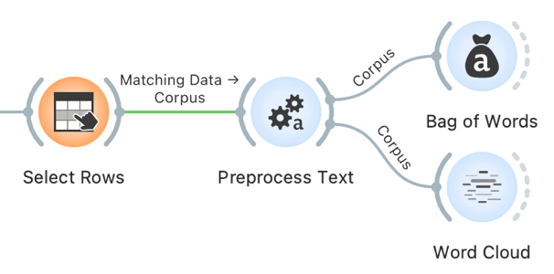
8First, we will create a subcorpus with a strong presence of topics T1: UK & nation and T16: media freedom. We do this with the Select Rows widget, which we will connect to Topic Modelling. We have to set two conditions in the Select Rows widget: Topic 1 is greater than 0.4, and Topic 16 is greater than 0.4 (Figure 19). We will select the speeches where the two topics are present with over 40-percent probability.16
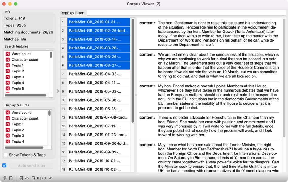
9Select Rows is then connected to Corpus Viewer, which displays the selected 26 speeches at the intersection of nation and media (Figure 20). It is clear from the speeches that they refer to internal matters of organisation of the two Houses of the Parliament and the specific roles given to the MPs.
1Try it yourself: Explore the Topics 3 and 5 in the same way.
6.3. Topics before and during the pandemic
1We identified the topics which stand out the most in our corpus, but now we would like to investigate which topics are the most characteristic of the pre-pandemic and the pandemic periods. The differences between the two periods (already labelled in the data with Reference and COVID) can be explored with Box Plot. The visualisation, also known as a box-and-whisker plot, shows the distribution of the variable and enables an easy comparison of topic probability by categorical variables (i.e., gender, date, party).
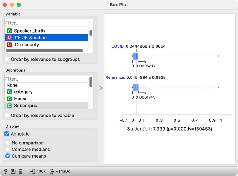
2Connect Box Plot to Edit Domain, which will keep our assigned topic labels. As we wish to compare two periods, select the Subcorpus variable in the lower-left section of the widget. In the upper left section, select T1: UK & nation. On the right side, we will see two box plots, the upper for the pandemic period (COVID) and the lower for the pre-pandemic period (Reference) (Figure 21). The visualisation shows that the debates on the UK nation were more frequent before the pandemic than during the pandemic. At the same time, the test result below the plot shows that the difference is statistically significant, as its p-value is below 0.05. We can conclude that historical topics were more frequent before the pandemic based on this information.
3We could inspect the distribution for every topic separately, but this would be quite laborious. Since we are not focusing on a single topic but would like to understand which topics show the most difference between the two periods, we will use the Order by relevance to subgroups option in the Variable section. This option will sort the variables based on the results of the statistical test. At the top, we will see those variables that show the greatest difference for the selected categories, which we defined in the Subgroups section (the Subcorpus variable).
4At the top of the list, we will see the variables such as category, From, To, and Term. These variables show the greatest differences between Reference and COVID subcorpora. The difference is unsurprising since these variables are time-related, which was also a criterion for forming the two subcorpora (see Chapter 5.3). We are more interested in the variables following these four.
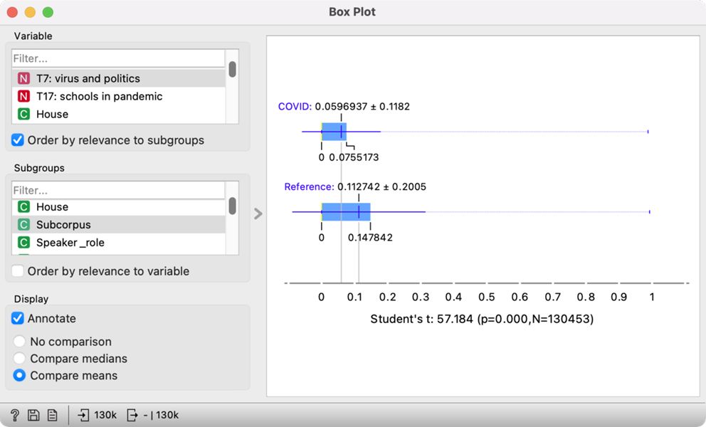
5At the top are the topics T7: virus and politics (Figure 22) and T17: schools in a pandemic. Once we select one of them, the visualisation on the right shows that the MPs talked more about the virus and politics in the pre-pandemic period and more about the school in the, unsurprisingly, pandemic period. The Student's t-test (57.184, p<0.05) below the plot shows that the difference between the two periods is significant and that the topic is more prominent in the given period. The result for Topic 17 is unsurprising, but the result for Topic 7 is a little strange. One would expect the speeches on the virus to be more prominent during the pandemic. Looking at the speeches in Corpus Viewer, this is indeed the case – all the speeches containing the word »virus« come from the COVID period. We see that these speeches talk about the virus in the context of the EU response to the pandemic (making it likely that the virus under consideration is indeed the coronavirus and not some other pathogen). However, the significance of the pre-pandemic period in this case is due to a large portion of speeches belonging to the pre-pandemic period. Skimming through the speeches, we can see that the topic consists of speeches covering a range of EU-related issues linked to Brexit which was in the spotlight before the COVID outbreak.
6The results show the usefulness of topic modelling, but they also point out how vital it is to understand the corpus and explore the speeches with close reading.
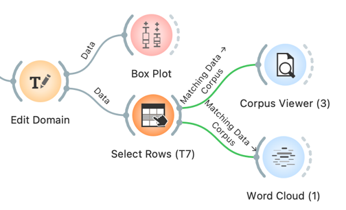
7The topics can be further explored with Select Rows and Corpus Viewer. Connect Select Rows toEdit Domain. In Select Rows, set T7: virus and politics is greater than 0.98, by which we will output only the speeches with more than 98% likelihood of T7. The selected speeches can be inspected in Corpus Viewer or with Word Cloud.
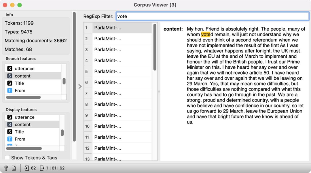
8Corpus Viewer enables us to explore the context of a given word. Let’s say we are interested in learning more about the lemma »vote«, which is characteristic of Topic 7 (see Chapter 6.1.2). We have already selected speeches with a high frequency of Topic 7, which outputs 62 speeches. We would like to see which out of those contain the lemma »vote«. We can enter the lemma in the filter at the top of the widget and press Enter. The widget will display the speeches where the lemma »vote« appears – there are 36 such speeches. Indeed, we can see that the speeches refer to the relationship with the EU (Figure 23).
9An alternative option is to display the most frequent lemmas for the topic in a Word Cloud. Word cloud would give an in-depth look into the concepts discussed in this topic (Figure 24).
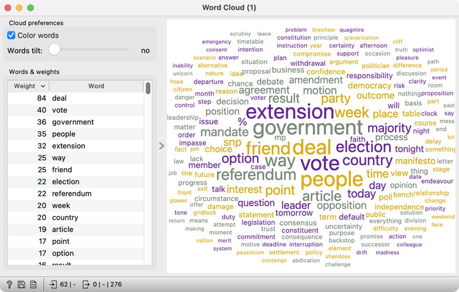
10The speeches mostly refer to deals, voting, government, people, and extension. Considering that the lemma referendum is also quite prominent, these speeches probably refer to Brexit. While almost exclusively present in this topic, it seems like the word virus is generally quite infrequent in these speeches. The results indicate virus has to be interpreted in the context of other words characterising Topic 7. It is vital to compare the frequency of characteristic words for the topic and the frequency of words in the corpus (like we did in Chapter 6.1.3) to ensure accurate topic interpretation.
1Try it yourself: In the same way we compared the subcorpora Reference and COVID, compare the distribution of topics in opposition and coalition speeches.
15. It is possible to get a different result with LDA than seen in the tutorial. LDA is a generative model, which initiates randomly. You should always be able to get the same results on your computer, but the results can differ between different versions of Orange and different operating systems.
16. The threshold of 40 percent is selected because it is the lowest value which returns at least a couple of documents. One should be aware that the threshold is low, which means the speeches do not have a very high likelihood of the two topics. The value can be adjusted freely.